How casino brands differentiate themselves through design and tonality
How casino brands differentiate themselves through design and tonality
At first glance, many online casinos seem interchangeable: similar game categories, comparable bonus mechanics, identical payment methods. Nevertheless, users perceive brands very differently - some appear serious and clear, others loud and "pushy", others modern and community-oriented. The decisive difference is often not in the product core, but in the staging: design, tonality and the way a platform explains decisions, guides users and builds trust.
Especially in a market where offers can be compared in seconds, visual and linguistic signals are becoming real competitive factors. This is particularly true in Austria, where users often react sensitively to seriousness, transparency and comprehensible communication. If you want to improve brand impact, you should therefore not only think about features, but about the entire brand interface: from the first banner to the support response.
Design as a signal of trust: colors, typography and visual hierarchy
In iGaming, design is not just "beautiful", but functional. Colors, contrasts and typography determine whether a page appears calm and credible or cluttered and hectic. A clear visual hierarchy helps users to grasp the most important information immediately: Where do I register? Where can I deposit and withdraw? Where are the rules, limits and verification steps?
Many brands differentiate themselves through their "look": minimalist interfaces often appear premium and mature, while strong neon colors and moving elements tend to focus on entertainment and impulse. Both can work - the decisive factor is consistency. If a casino focuses on high-gloss premium, but uses unclear microtexts or chaotic pop-ups in important dialogs, the brand illusion is broken. Conversely, a playful style can be credible if navigation, readability and rule transparency remain stable.
Another point is the visual language: stock motifs with generic "win" symbols are common, but quickly appear arbitrary. Brands that use their own illustrations, recognizable icons or consistent characters create differentiation because they visually build their own world.
UX and microcopy: where brand voice really becomes visible
Many users perceive tonality not only in advertising texts, but in the small moments: Error messages, confirmation dialogs, notes on limits or verifications. This microcopy determines whether a platform feels respectful and clear or patronizing and obfuscated.
Good UX tonality is precise. It explains the next step without threatening or pushing. It uses simple terms instead of internal jargon. And it creates expectation management: How long does a payout typically take? What documents may be required? What happens when a bonus expires? In Austria, this clarity is particularly valuable because trust is often built through comprehensibility.
Another subtle lever of differentiation is the way responsible gaming elements are handled. Are limits and self-control functions visible without overwhelming the user? Is the topic treated seriously or just ticked off as a mandatory banner? Brands that communicate consistently and calmly in this area will appear more credible in the long term.
Tonality strategies: From "premium" to "entertainment" - but please make it appropriate
Tonality is the sum of word choice, sentence rhythm, address and attitude. Some casinos speak in a sober and service-oriented manner, others in a more relaxed manner, and still others with a strong "gamification" vocabulary. The important thing is not which tonality is "better", but whether it suits the target group, the visual identity and the actual user experience.
A premium brand often uses short, clear sentences, reduces superlatives and relies on safety signals: transparency, support, stable processes. An entertainment brand works more with emotion, event logic, actions and dynamic language. It becomes problematic when the tonality raises expectations that the platform does not fulfill. If everything sounds like "VIP" but the operation is complicated, disappointment arises - and with it friction in trust.
In practice, you can recognize consistent brand management by the fact that the same voice is present everywhere: in push messages, in the help center, in bonus conditions, in emails and in live chat. It is precisely this consistency that is often underestimated, but is a strong differentiating factor.
Brand example as orientation: Consistency instead of pure optics
A concrete look at individual brands helps to make principles tangible. Many users associate a platform not only with games, but also with a certain "look and feel": modern, classic, playful, serious, fast. This impression is created by repeating the same design and language patterns across all contact points.
At VulkanVegas, it is easy to see how important consistent design and clear structuring are so that users do not get lost in a large offering. Recognition value is created less by individual elements than by their interaction: Navigation logic, visual order, tonality in short texts and the way content is presented in a bundled manner. This is a central point for brand work: differentiation is rarely a "hero element", but a system.
Quick comparison: How to recognize design and tonality profiles
Before you strategically evaluate a brand, a grid helps. It's not about pigeonholing everything, but about identifying typical signals. The following table shows common characteristics and the effect they often have.
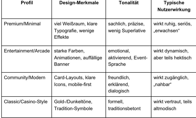
This overview makes it clear that differentiation is the result of conscious decisions. Those who want to be "everything" at the same time usually appear inconsistent - and therefore less trustworthy.
Differentiation is a system of design, language and behavior
Casino brands are not only differentiated by games or promotions, but above all by what users experience on a daily basis: visual order, comprehensible texts, a consistent brand voice and UX behavior that justifies trust. In Austria, this differentiation is particularly relevant because users often look for clarity, reliability and comprehensible processes.
If you want to evaluate or develop a casino brand, check the basics first: is the visual hierarchy clear, are microtexts understandable and does the brand sound consistent in support, help center and bonus rules? If you are consistent here, you will create differentiation that lasts longer than any individual campaign.